
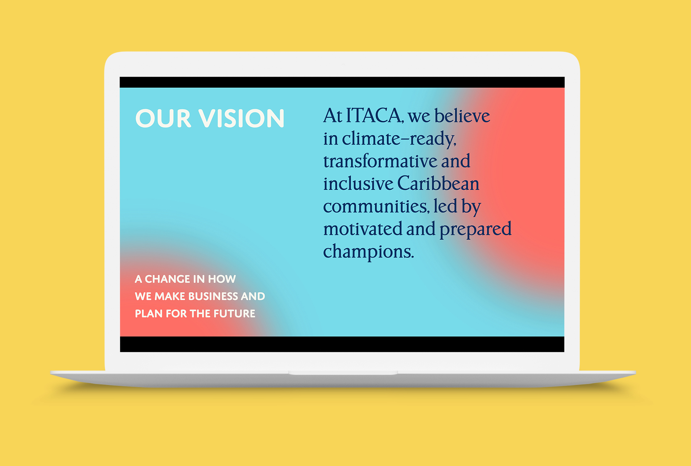
Itaca is a newly born company working to assist the Caribbean region in responding to climate change. Its founder and CEO, Laura Canevari, asked for a visual identity that could convey Itaca’s courageous approach and establish the company as credible and relevant actor within the sector.

Coming in at its very start with minimal resources, Itaca needed to develop a strong visual voice of its own.
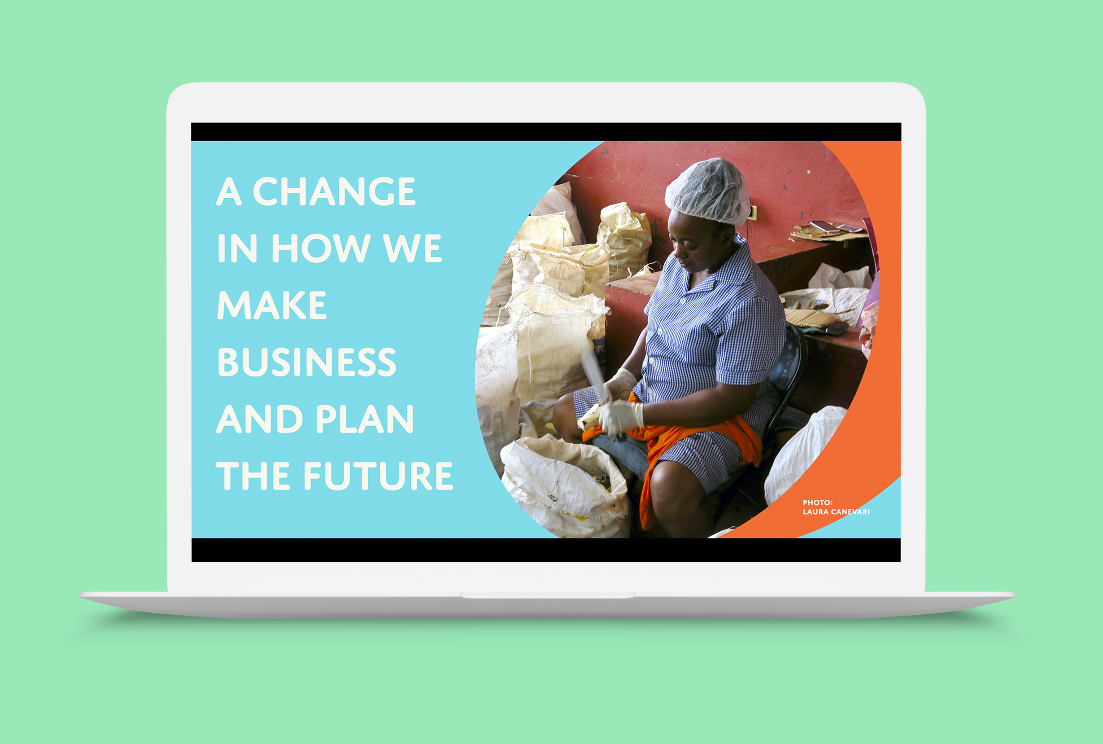
The visual research focused on defining a fresh, flexible language full of color, life and movement. Itaca’s logotype bears a bespoke C conveying a sense of movement and connection with the sea—the main feature of the region in which Itaca operates.
The visual research focused on defining a fresh, flexible language full of color, life and movement. Itaca’s logotype bears a bespoke C conveying a sense of movement and connection with the sea—the main feature of the region in which Itaca operates.

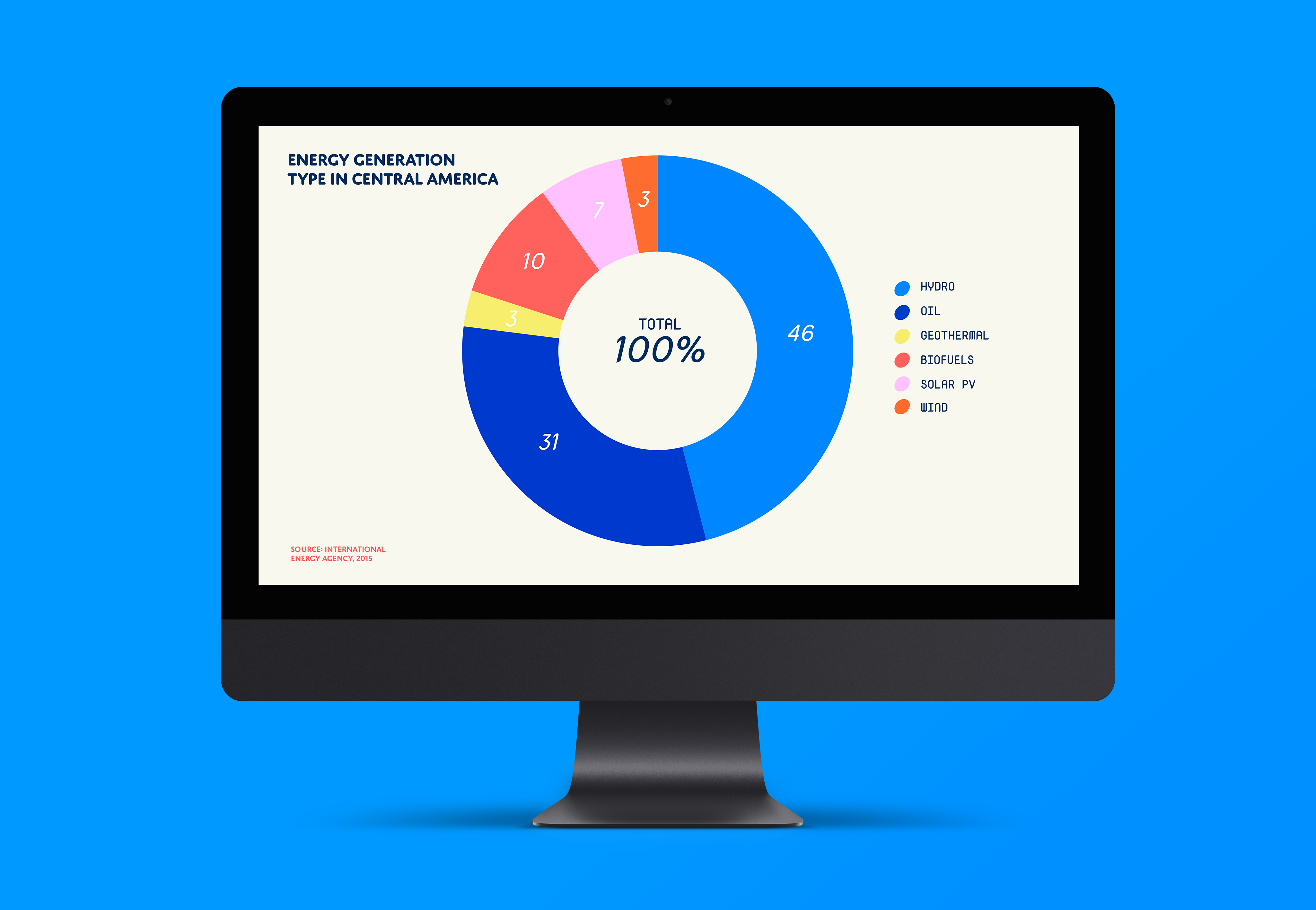
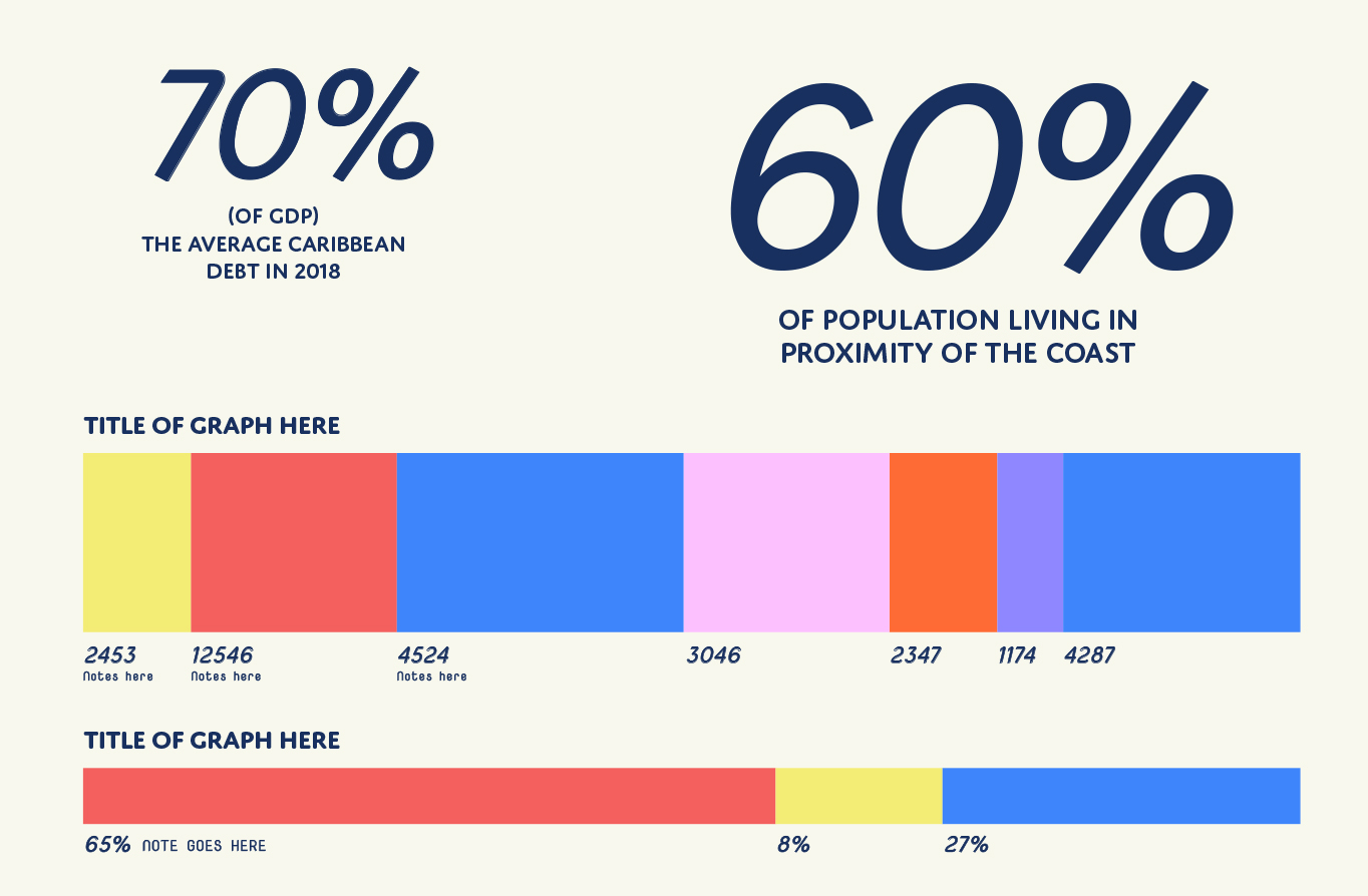
We designed a start package that included institutional deck, business cards, social media graphics, a one-page website and a framework for data visualisation, with flexible options and templates across media.

The identity is built on a system of flexible, bold color combinations to reference both the region and its cultural heritage, as well as the energic, fresh approach Itaca brings to climate adaptation.


Together with bold colors, a layered and fresh typography is at the center of Itaca’s visual voice, mixing playfullness and rigour.

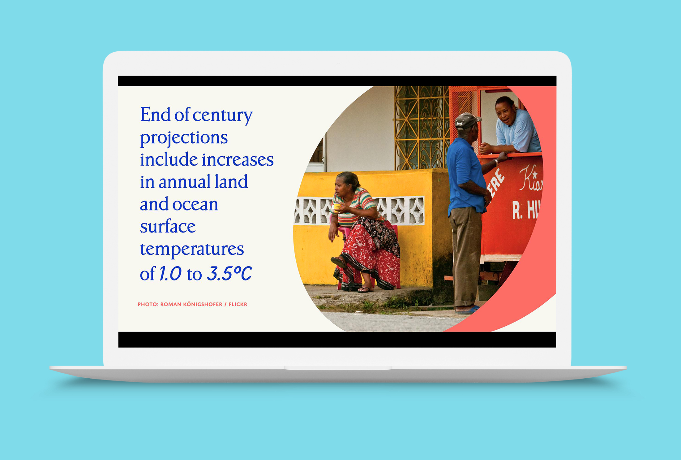
From the typeface for numerals derives one of the central elements of the identity: “the Dot”, a tilted shape used to highlight images and data, and bring layering to the visual language. The Dot is the dynamic lens of adaptation through which Itaca looks at the world.


Patterns in vibrant color combinations referencing the concept of adaptation and movement function as backgrounds and evocative visuals.
Starting from a reference given by the client, a pattern of moving land was designed, and its close-ups generate endless variations of color and form.
Starting from a reference given by the client, a pattern of moving land was designed, and its close-ups generate endless variations of color and form.


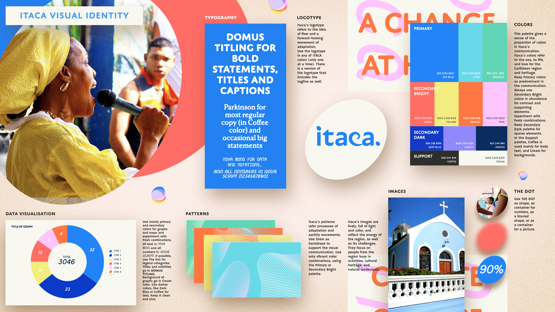
The overview of the brand guidelines pays tribute to Deborah Sussman’s visual guidelines for the 1984 Olympics in Los Angeles.
More work ⇣